Rebranding UXUI
Case Study of
Arpana dance studio has an outstanding reputation within the community but the website does not reflect the brand and justify it's value to the culture. Users often have a difficult time navigating the site, therefore they don’t visit it often, just call to schedule classes but that created another complication to the business. We set out to redesign the website that can showcase the studio, brand message and make user experience more understandable and friendly, responsive across different devices, and create an optimal navigation.
Arpana
Traditional Dance Studio


User research & interview
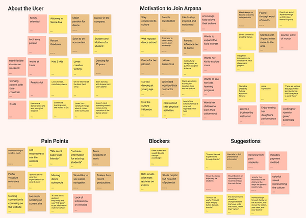
After we evaluate the company's website, we found out from our research and interviews that our user then to have trouble finding the information they are looking for, navigating through the site experience was very confusing and frustration with the content structure and overall uneven interface.


Interview with Arpana Founder
Ramya Harishankar
Arpana Founder and Creative Director
We also had the opportunity to speak with Ramya Harishankar, the founder, creative director, and main “guru” (or teacher) of the dance school and company. Where she shared that her mission is to cultivate a love for dance in her students and to inspire others through the art form.
Direct & Indirect Competitors
Once we got to know our users, and got more insights from the founder, we wanted to get to know the competitors, professional cultural dance studios in the OC area.

Affinity Diagram
We gathered our interview data from our stakeholder and users and after arranging it into an affinity diagram we saw that the main pain points for our users was that the site was difficult to navigate, out of date, and that it was almost impossible to find information users find relevant.
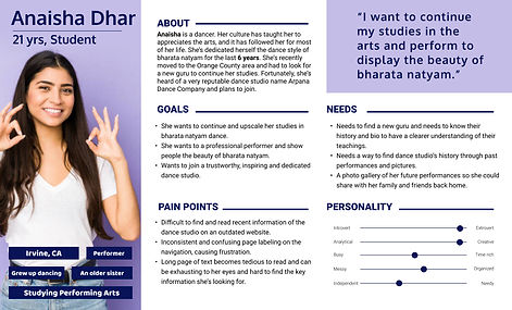
User Persona
Development
Our initial persona was young students, teenagers who are into India traditional dance classes and experience, after more research and interview, we had discovered a secondary persona which is the moms that have interest into introducing the culture to their young kids, want their kids to know their roots. and learn from the well-known instructor.

Problem
Statement
Through user interviews and surveys, we found that most users visit the Arpana website to keep track of upcoming events and to view photos from past productions. Users find the site outdated, inconsistent, and don’t feel it provides the functionality they want. By streamlining the navigation and presentation of information, we can transform the site into something that reflects the reputation of the company and increases engagement.


To improve this, we did some card sorting and site mapping. We also took inventory of the current sites content to ensure nothing was getting left out in our new, simplified navigation.
Arpana
Redesigned
Sitemap

To ensure logical content order as well as a clear overarching message and story, customized sitemap were created to guide the design and development process. Organized the content and develop a structure that would make it easiest for users to find what they need without having to dig for it.

One by one, we strategically tackled updating Arpana’s brand assets so they could feel as proud of how they show up in the marketplace today. The first step was a logo evolution.
To make sure we have cohesive and professional look through out the site, we redesigned the logo with a modern twist. The word "Arpana" means offering, So we want to make sure we incorporate that into the logo design concept, and make sure Arpana’s message is clear, unique and beautiful enough to showcase itself.
From all the informations and data we have, we designed this color pallet and style tile that can best represent Arpan and the culture. In Hindu religion, our primary color, maroon means happiness, auspicious and purity. The secondary color mustard is the color of knowledge and learning, we believe these colors are the best to reflect to Arpana’s mission. And to fresh up the look, we want to introduce a modern, vivid, colorful and inspiring vibe into Arpana, we came up with a lot of culture related graphics to support this vision.

UI Element Style Guide

Style Tile
This trend places ease of use and inclusivity front and center. Accessibility is changing the way we think about site design. There’s been a real push to demonstrate inclusivity visually and ensure every visitor has the best on-site experience.
Good web design is about creating an experience for site visitors that is easy to use, navigate, and, most importantly, accessible to everyone. As website accessibility becomes more common and mainstream, web designers will continue pushing the envelope of what’s possible while maintaining attractive design.”

We started with mobile design and then RWD. We want to make sure our users have the best experience while using our site with no sizing constrain like before and enjoy the interactions we design. After the fundamental structures are all planned out, we moved into low-fi wireframe in FIgma.
Wireframe
Development
Low-fidelity
Fireframes
This trend places ease of use and inclusivity front and center. Accessibility is changing the way we think about site design. There’s been a real push to demonstrate inclusivity visually and ensure every visitor has the best on-site experience.


Visual | Brand Design RD
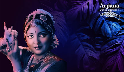
We asked the founder for some of her favorite image that can represent the culture and studio, and also did some research on the history and meaning of them dance. Used our creative juice and designed some background image that can tie in to the company and vibe.


High-fidelity
Prototype
Create, integrate, visualize and communicate planning concepts as we moved from the initial vision through implementation. The final high-fidelity prototype is more sustainable, convenient, equitable, efficient and attractive.
.png)
.png)

.png)
From create, integrate, visualize and communicate planning concepts, from the initial vision through many ideation and implementation.
Full Spectrum
of the Development

HTML Coding
This trend places ease of use and inclusivity front and center. Accessibility is changing the way we think about site design. There’s been a real push to demonstrate inclusivity visually and ensure every visitor has the best on-site experience.

Next step in the plan
Two weeks of non-stop process of transforming Arpana Company into the a stunning and human-center website.
-
Design a seamless payment process for class and events purchase
-
Create a user profile account for easy class and event booking
-
Making the site responsive
-
Collaborating with the stakeholder to integrate the design